
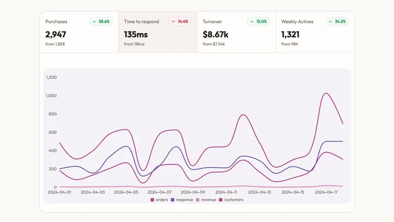
KPI Line Panel


 +6
+6Use this Skill to create infographic.
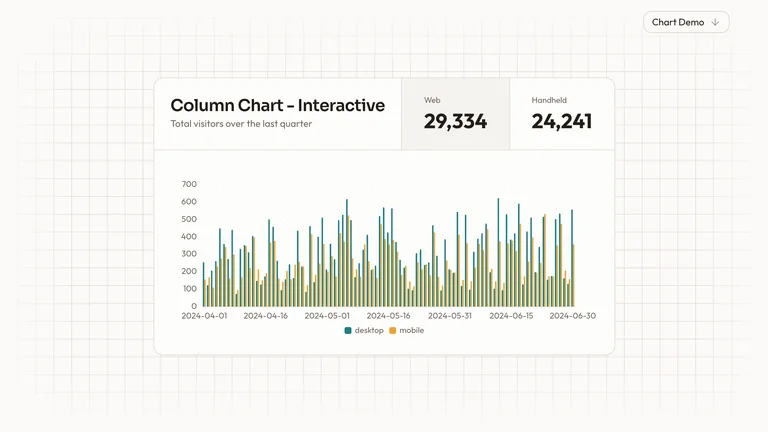
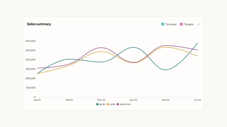
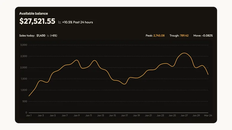
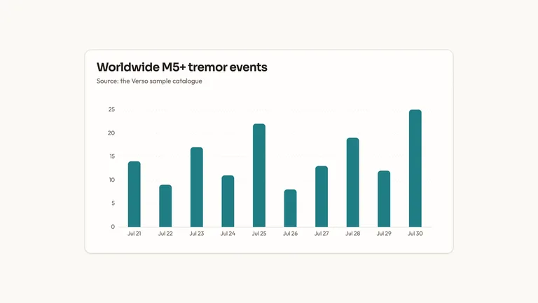
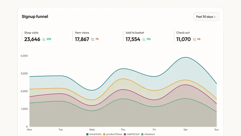
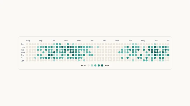
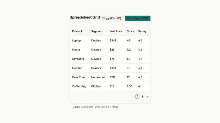
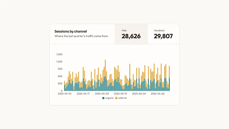
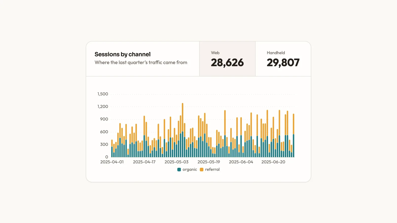
Stacked Column Chart is a ready-to-paste data visualization, delivered as editable source with its usage example. It ships with charts drawn through one charting layer, not hand-rolled SVG and a canvas-rendered backdrop that runs without a WebGL library. Colour, type and radius live as tokens you edit once for the whole block.
Picked most often by
Updated Aug 31, 2026
Runs in


Generates with
0 reviews
Rate this Skill
Pick a star rating to write a review
No reviews yet.
Ratings and success rates appear once there is a real sample; we never show percentages without one.